Newsarama has posted an exclusive look at the new logos for all 52 of the books launching in September. Here are my thoughts!
The Good:
Batgirl and Batman
Batwoman and Catwoman. We've seen the Batwoman logo before, on the Batwoman Elegy collection and Batwoman #0. I really love the Catwoman logo. It feels more wild than the previous logos.
The Bad:
Honestly, there were no logos that I found outright bad.
Nightwing's logo feels a little evocative of the Batman & Robin movie from 1997. But that may just be me. I still don't think it's "bad."
Justice League Dark. This one is less bad and more boring.
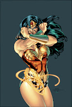
Wonder Woman. Again, not outright bad, just a little boring.
There were also quite a few books that didn't change logos at all, including Batman and Robin, Green Lantern, Green Lantern Corps, Superman, Superboy, and Supergirl.
Check out all 52 of the new logos at Newsarama!
Subscribe to:
Post Comments (Atom)


1 comment:
The problem problem with the Nightwing logo is the font and/or the coloring of the text. The Batgirl and Batman logos are much better in this regard though I would have done a darker gold for the Batgirl logo.
Also, the Wonder Woman logo isn't very original. It's too much like older logos.
Post a Comment